Download free Gill Sans Ultra Bold Regular font | GillSansUltraBold.ttf
(0 vote)
Gill Sans Ultra Bold Regular font by DafontFree. File script name GillSansUltraBold.ttf download free for Personal Use.
About Gill Sans Ultra Bold Regular font
Download font
Free for Personal Use
This fonts are authors' property, and are either shareware, demo versions or public domain. The licence mentioned above the download button is just an indication. Please look at the readme-files in the archives or check the indicated author's website for details, and contact him if in doubt. If no author/licence is indicated that's because we don't have information, that doesn't mean it's free.
- GillSansUltraBold.ttf
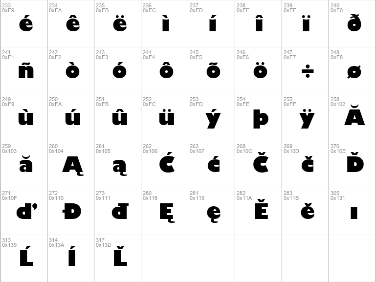
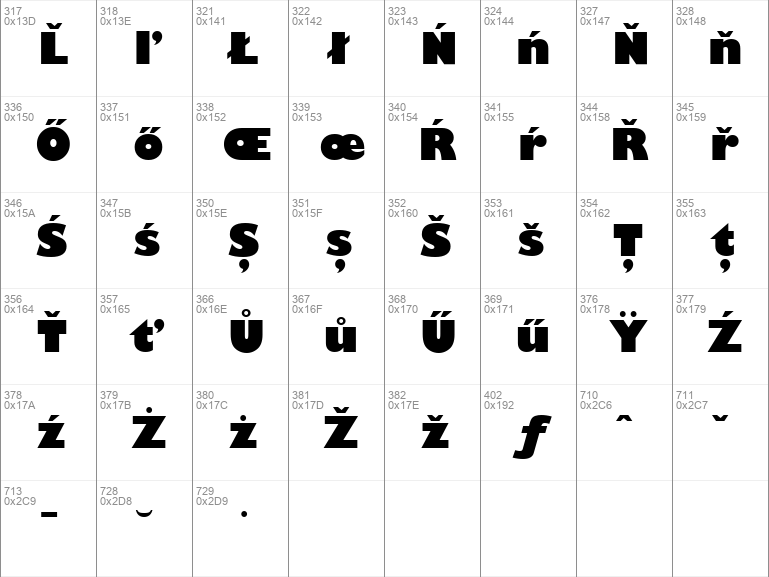
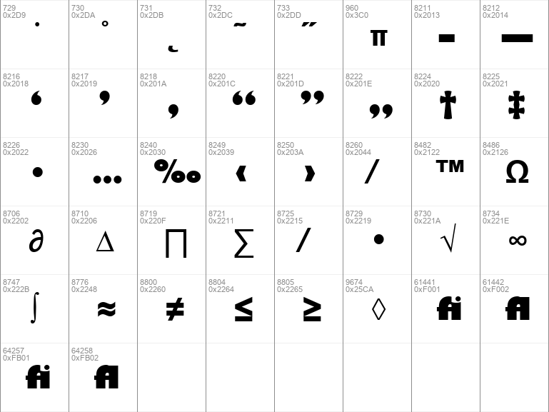
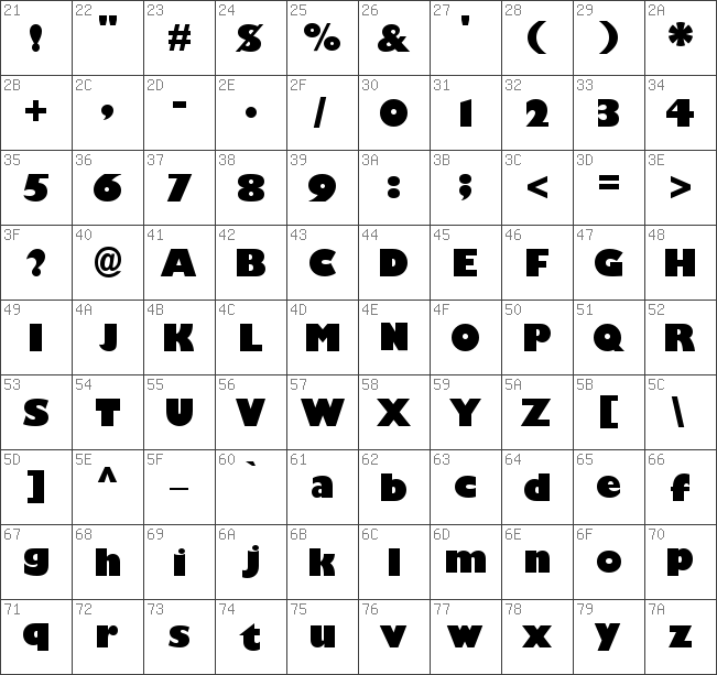
Image Demo
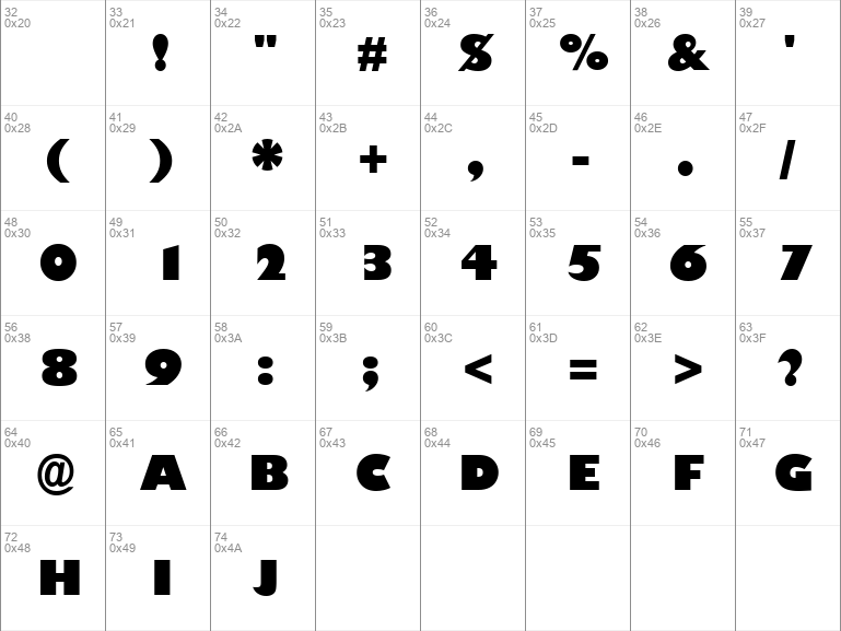
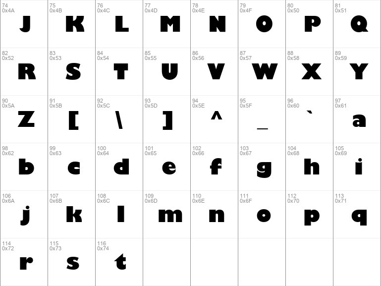
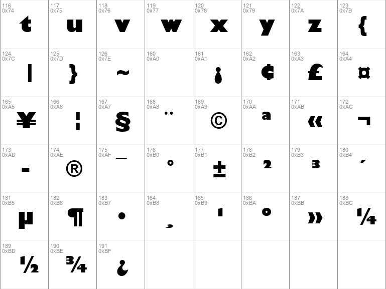
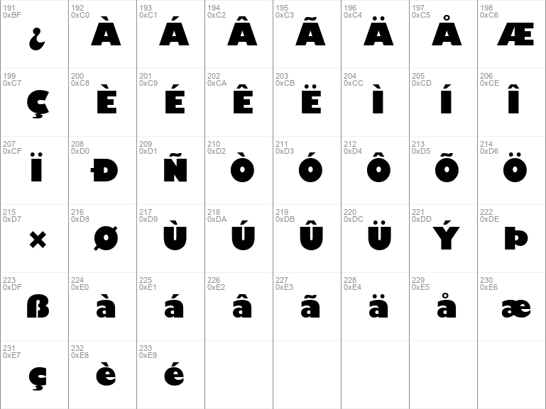
Gill Sans Ultra | GillSansUltraBold.ttf
- Font family: Gill Sans Ultra Bold
- Font subfamily identification: Regular
- Unique identifier: Monotype - Gill Sans Ultra Bold
- Full font name: Gill Sans Ultra Bold
- Version: Version 1. 61
- Postscript font name: GillSans-UltraBold
- Trademark notice: Gill Sans¨ is a trademark of The Monotype Corporation, Inc. which may be registered in certain jurisdictions.
- Manufacturer name: Monotype Typography
- Designer: Eric Gill
- Description: Monotype Type Drawing Office 1928. Gill studied under the renowned calligrapher, Edward Johnston, the designer of the London Underground sans serif typeface. This influenced Gill who later experimented with sans serif designs, and in due course produced a set of capital letters. These became Monotype series 231, produced in 1923, and the forerunner of the extensive Gill Sans range now available. A twentieth century sans serif that has a simplicity of form which does not reject traditional forms and proportions, and gives the face a humanist feel. The lighter weights are highly readable in text and suitable for magazine and book work, whereas the heavier weights are best used for display in advertising, packaging, and labels.
#gill#sans#ultra#bold#regular#gill sans#sans ultra#ultra bold#bold regular#regular font#gill sans ultra#sans ultra bold#ultra bold regular#bold regular font#gill sans ultra bold#sans ultra bold regular#ultra bold regular font#gill sans ultra bold regular#sans ultra bold regular font#gill sans ultra bold regular font#download#free#download free#free fonts#download free fonts#serif#sans serif#old#school#old school#gill-sans-ultra-bold#gillsansultraboldttf#windows#ttf#gillsansultrabold#gillsans-ultrabold#monotype#typography#monotype typography#eric#eric gill
Comments (0)
Please login!