Download free General Failure Regular font | general-failure.ttf
About General Failure Regular font
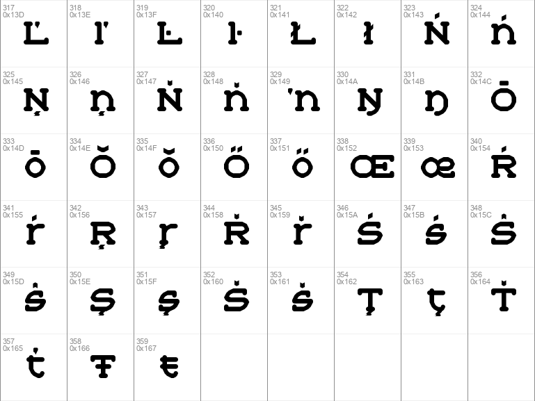
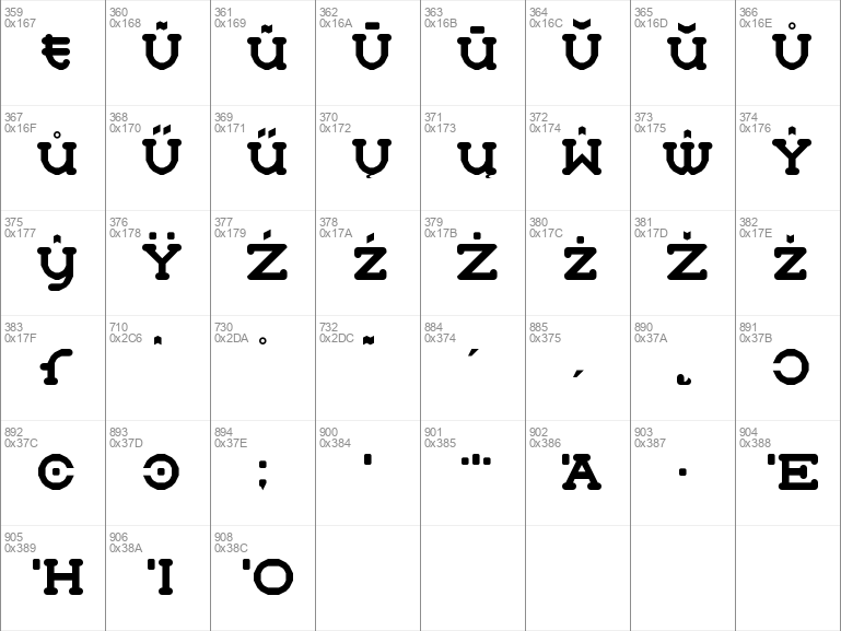
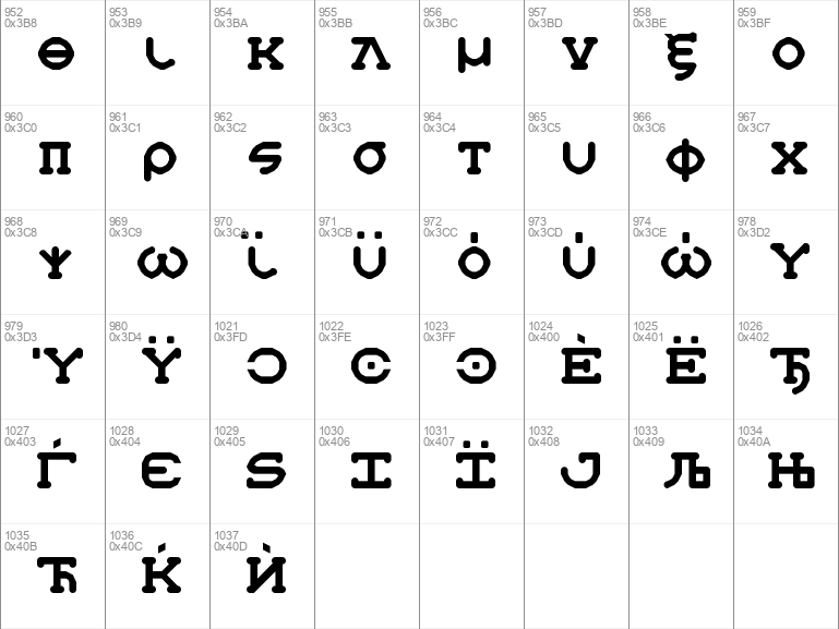
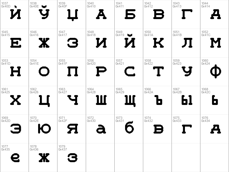
A tiny, cute Courier-like font. It can do both casual and formal moods, though it excels at the former, I think. The name is inspired by the old computer joke: "Who is General Failure and why is he reading my hard disk?"Supports Danish, Dutch, English, Esperanto, Finnish, French, German, Greek, Hungarian, Icelandic, Italian, Latvian, Lithuanian, Norwegian, Polish, Portuguese, Russian, Spanish, Swedish, and Turkish among others!
I worked hard on this one and it took many days. So why give it away? It's because I live to create and I want you and I to be able to enjoy things that are useful and free. No money has to get involved, no one has to email anyone or seek permission or get bogged down while they are trying to create. You can just download the thing you like and use it. This makes sense to me, so I'll keep doing it as long as I can.
Download font
Free for Personal Use
This fonts are authors' property, and are either shareware, demo versions or public domain. The licence mentioned above the download button is just an indication. Please look at the readme-files in the archives or check the indicated author's website for details, and contact him if in doubt. If no author/licence is indicated that's because we don't have information, that doesn't mean it's free.
- general-failure.ttf
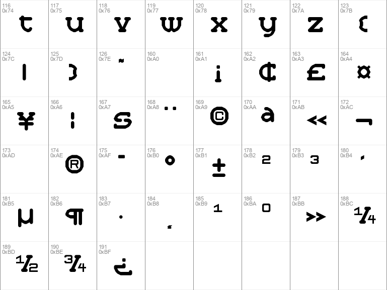
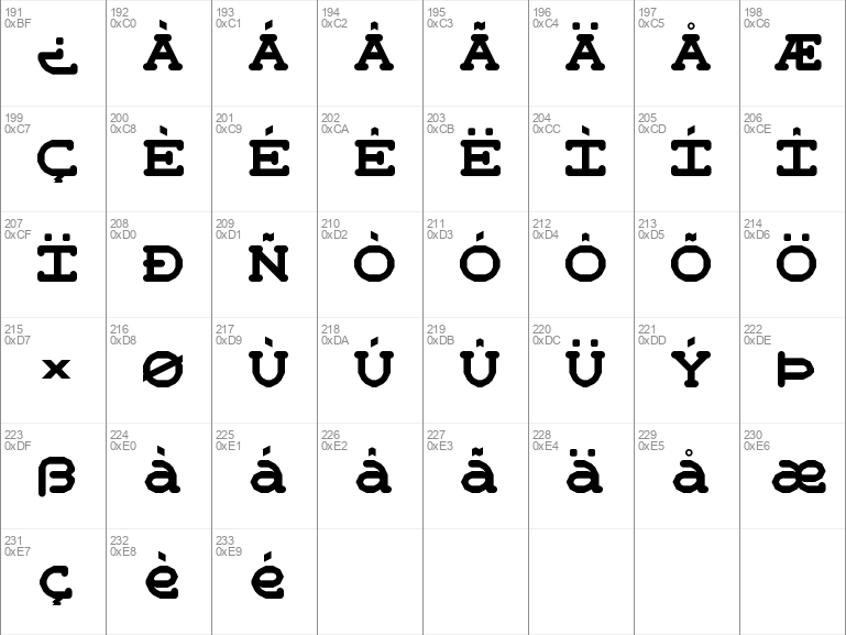
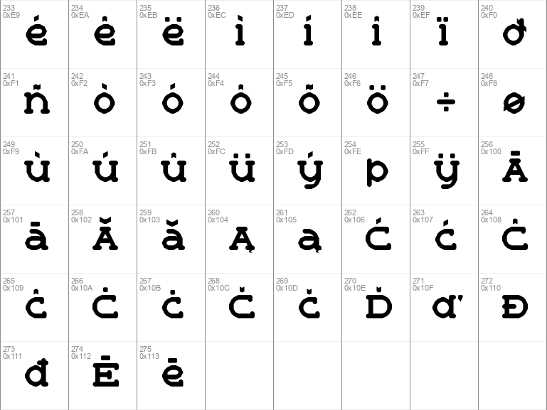
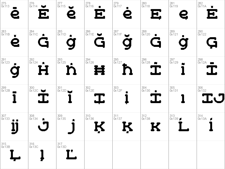
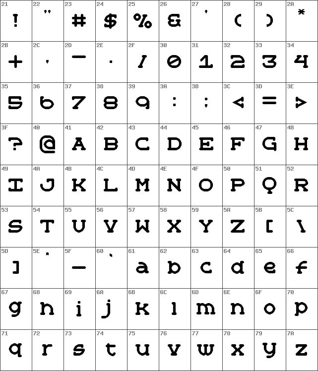
Image Demo

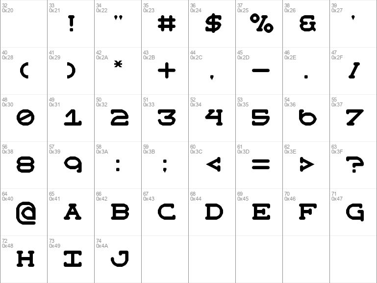
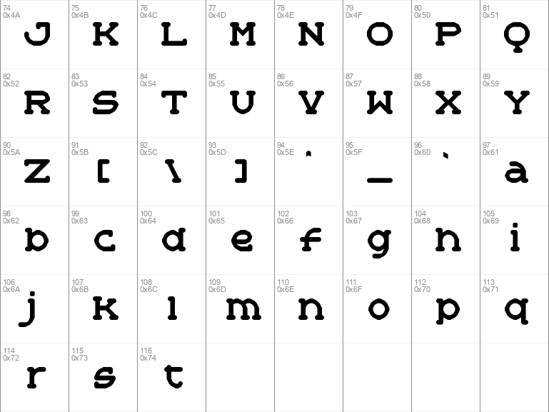

General Failure Regular | general-failure.ttf
- Font family: General Failure
- Font subfamily identification: Regular
- Unique identifier: General Failure
- Full font name: General Failure Regular
- Version: Version 1. 0
- Postscript font name: General-Failure
- Trademark notice: FontStruct is a trademark of FontStruct. com
- Manufacturer name: https:fontstruct. com
- Designer: zephram
- Description: ÒGeneral FailureÓ was built with FontStructDesigner description:
A vaguely Courierlike OSD Onscreen Display font which tries its best to be casual. The name is inspired by the old computer joke: "Who is General Failure and why is he reading my hard disk? "
No filters, faux-beziers or custom composites, just stock bricks. :D
*
More about the design:
It started as a doodle and an attempt to make a smooth, low-resolution, low-poly font, and then it became a Courierlike. I have other fonts that tried to do polygonal round shapes before this such as Cartoon Riot but this design is my first real success in that area.
Initially, I made the angled glyphs before the round ones. I didn't want to change them, so glyphs like C, O, and Q are a bit wider than they are tall. I'm quite fond of this, because in most designs these glyphs tend to have a tall and narrow character. I think the mildly squat look of this font makes it cuter and gives it more personality.
A lot of glyphs were altered in specific ways to look more like metal type, especially anything with a cedilla. Others were altered specifically to be interpretable at small size. I also use angled contours and actual round bricks alongside each other within the same glyphs, another technique which is geared toward style and interpretability at small size. Some diacritics had to diverge from this paradigm in order to have the proper appearance.
This font came with many new challenges and an array of new techniques had to be designed to solve them. Small loops are an insurmountable challenge because of the low resolution. So, rather than draw loops, I drew rounded areas to suggest them. You can see it on letters like Greek , , and .
- License: Creative Commons CC0 Public Domain Dedication