Download free LaurelOrHardy LaurelOrHardy font | LaurelOrHardy.ttf
(0 vote)
LaurelOrHardy LaurelOrHardy font by Norwegian Ink / Design for Dough. File script name LaurelOrHardy.ttf download free for Personal Use.
About LaurelOrHardy LaurelOrHardy font
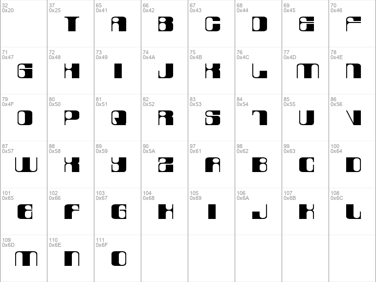
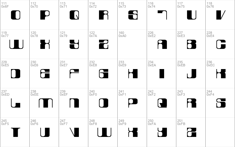
The font consists of 2 variations - lowercase (laurel) & UPPERCASE (hardy).It was originally designed as a logo-type for our little design agency in Oslo, Norway (see photo illustration). Note that it is based on a strict pattern of vertical thick and thin lines accomplished by shifting between upper- and lowercase glyphs, eg. "desiGN".
If requested we will build punctuation and numerals. For now this is merely a display font.
This is shareware, hence please share a sample screenshot of your publication if you apply this font in your work; we would love to see it ([email protected]).
Website: http://www.norwegianink.com
Download font
Free for Personal Use
This fonts are authors' property, and are either shareware, demo versions or public domain. The licence mentioned above the download button is just an indication. Please look at the readme-files in the archives or check the indicated author's website for details, and contact him if in doubt. If no author/licence is indicated that's because we don't have information, that doesn't mean it's free.
- LaurelOrHardy.ttf
Image Demo

LaurelOrHardy LaurelOrHardy | LaurelOrHardy.ttf
- Font family: LaurelOrHardy
- Font subfamily identification: LaurelOrHardy
- Unique identifier: 1. 000;pyrs;SCLaurelOrHardy
- Full font name: LaurelOrHardy
- Version: Version 1. 000
- Postscript font name: LaurelOrHardy
- Trademark notice: Norwegian Ink Design for Dough
- Manufacturer name: Frode Nordb¿
- Designer: Frode Nordb¿ Norwegian Ink Design for Dough
- Description: Originally made as a logo-type for a window-print www. norwegianink. com Please send me a notification at frode@norwegianink. com if you decide to use the font; i would love to see it applied somewhere else.
#laurelorhardy#laurelorhardy laurelorhardy#laurelorhardy font#laurelorhardy laurelorhardy font#download#free#download free#free fonts#download free fonts#groovy#laurelorhardyttf#windows#ttf#frode#nordb¿#frode nordb¿#norwegian#ink#design#for#dough#norwegian ink#design for#for dough#nordb¿ norwegian#ink design#design for dough#frode nordb¿ norwegian#nordb¿ norwegian ink#norwegian ink design#ink design for#frode nordb¿ norwegian ink#norwegian ink design for#ink design for dough#nordb¿ norwegian ink design#norwegian ink design for dough#frode nordb¿ norwegian ink design for dough
Comments (0)
Please login!