Download free ParadroidMono Light font | ParadroidMono-Light.ttf
(0 vote)
ParadroidMono Light font by Down fonts. File script name ParadroidMono-Light.ttf download free for Personal Use.
About ParadroidMono Light font
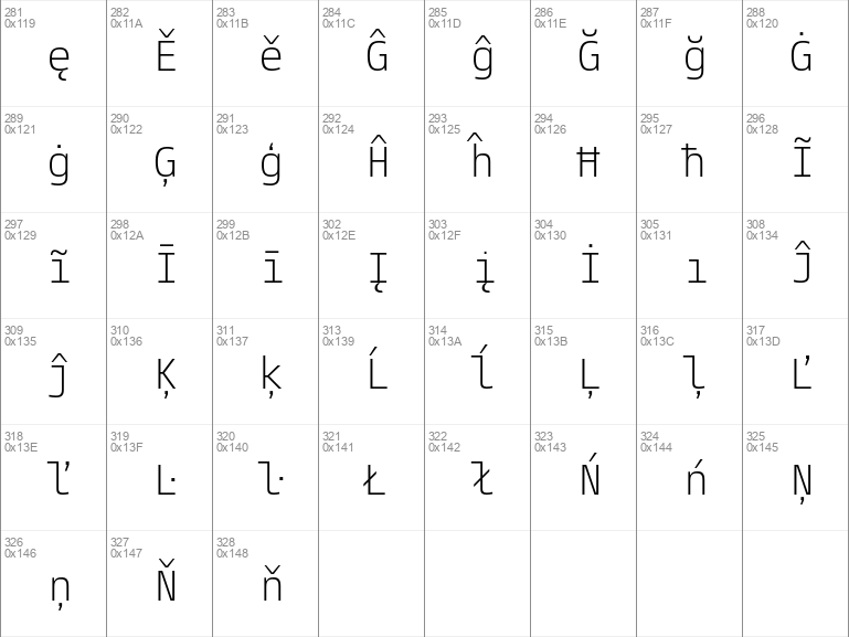
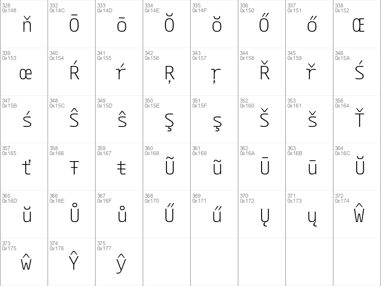
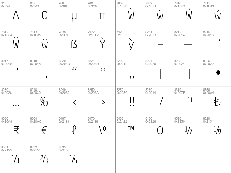
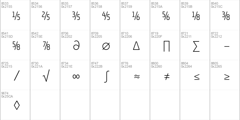
A pragmatic mono-spaced sans-serif which sits in the centre on the grotesque to geometric style spectrum. Equal measures of both letterforms create a neutral type family that is modern, functional, and easy to read without being too distractive.Details include 750 characters with an alternative lowercase a and g, twelve variations of numerals with stylistic zero's, Opentype features inferiors, superiors, fractions, case-sensitive punctuation, and language support covering Western, South and Central Europe.
Website: http://www.thenorthernblock.co.uk
Download font
Free for Personal Use
This fonts are authors' property, and are either shareware, demo versions or public domain. The licence mentioned above the download button is just an indication. Please look at the readme-files in the archives or check the indicated author's website for details, and contact him if in doubt. If no author/licence is indicated that's because we don't have information, that doesn't mean it's free.
- ParadroidMono-Light.ttf
Image Demo


ParadroidMono Light | ParadroidMono-Light.ttf
- Font family: ParadroidMono
- Font subfamily identification: Light
- Unique identifier: 1. 000;TNB ;ParadroidMono-Light
- Full font name: ParadroidMono Light
- Version: Version 001. 000 Jan 2018
- Postscript font name: ParadroidMono-Light
- Trademark notice: Paradroid is a trademark of The Northern Block
- Manufacturer name: The Northern Block Ltd
- Designer: Jonathan Hill
- Description: A pragmatic sans-serif which sits in the center on the grotesque to geometric style spectrum. Equal measures of both letterforms create a neutral type family that is modern, functional, and easy to read without being too distractive.
#paradroidmono#light#paradroidmono light#light font#paradroidmono light font#download#free#download free#free fonts#download free fonts#basic#basic fonts#the northern block#ttf#paradroidmono-lightttf#the#northern#block#lightttf#paradroidmono-light#ltd#the northern#northern block#block ltd#northern block ltd#the northern block ltd#jonathan#hill#jonathan hill
Comments (0)
Please login!