Download free Seeds of Discord Regular font | SeedsOfDiscordRegular-ALPVA.ttf
About Seeds of Discord Regular font
Download font
Free for Personal Use
This fonts are authors' property, and are either shareware, demo versions or public domain. The licence mentioned above the download button is just an indication. Please look at the readme-files in the archives or check the indicated author's website for details, and contact him if in doubt. If no author/licence is indicated that's because we don't have information, that doesn't mean it's free.
- SeedsOfDiscordRegular-ALPVA.ttf
Image Demo


Seeds of Discord | SeedsOfDiscordRegular-ALPVA.ttf
- Font family: Seeds of Discord
- Font subfamily identification: Regular
- Unique identifier: Seeds of Discord
- Full font name: Seeds of Discord Regular
- Version: Version 1. 0
- Postscript font name: Seeds-of-Discord
- Trademark notice: FontStruct is a trademark of FontStruct. com
- Manufacturer name: https:fontstruct. com
- Designer: zephram
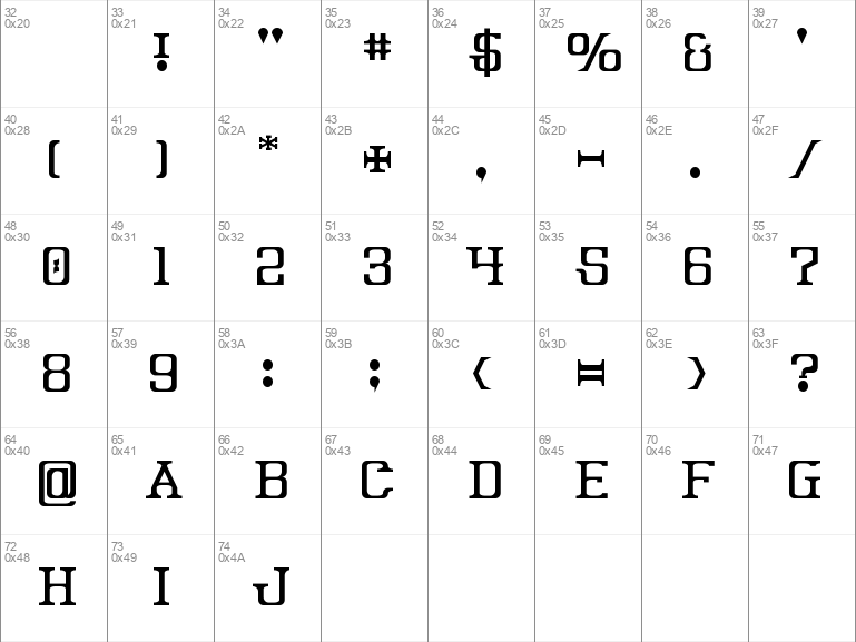
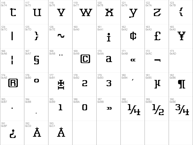
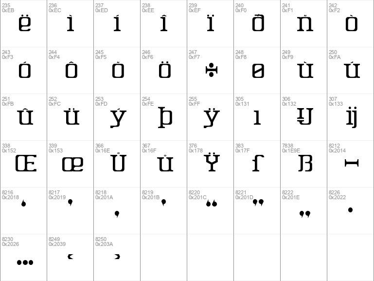
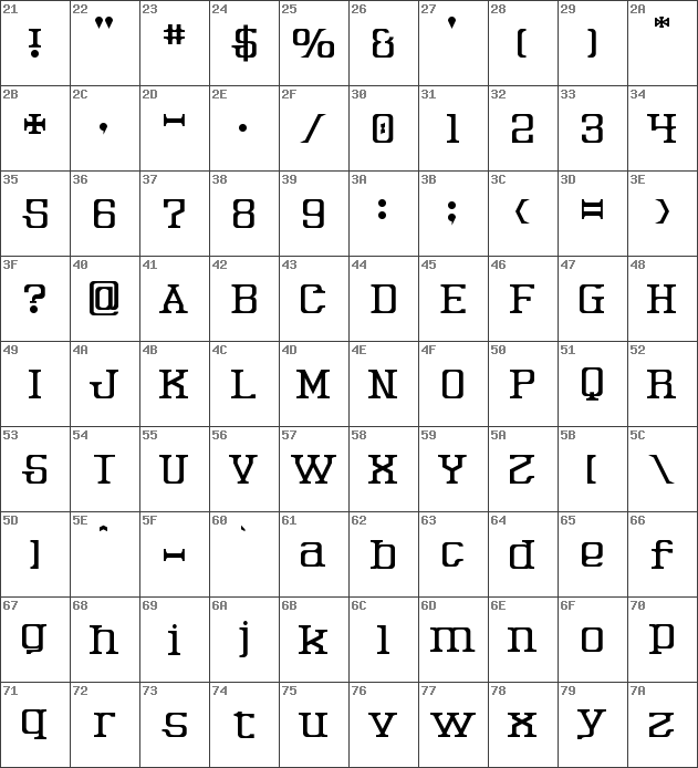
- Description: ÒSeeds of DiscordÓ was built with FontStructDesigner description:
An avantgarde serif with a mild horror theme. It takes advantage of the properties of antialiasingtext smoothing algorithms to render a convincingly handmade aesthetic.
Making attractive, consistent, nonpixel serif designs at this grid size is quite a challenge. Making them look handmade is even moreso. I've tried that many times, but this design is the first such one I felt was truly usable. It doesn't quite look typewriter-esque, but blends well with other designs that are.
For this I used many different serif shapes, with each one depending on how the line it was attached to wanted to bend or terminate. This is in contrast to most other serif designs I've seen, in which the serifs themselves are more consistent in shape. I decided against faux-bezier curves for this, because they all looked way too polygonal. I think this is one of few cases where a rectangular O and S enhance the overall design rather than weakening it.
This is mostly kerned now.
- License: Creative Commons CC0 Public Domain Dedication