Download free Disturbance Regular font | Disturbance.ttf
(0 vote)
Disturbance Regular font by DafontFree. File script name Disturbance.ttf download free for Personal Use.
About Disturbance Regular font
Download font
Free for Personal Use
This fonts are authors' property, and are either shareware, demo versions or public domain. The licence mentioned above the download button is just an indication. Please look at the readme-files in the archives or check the indicated author's website for details, and contact him if in doubt. If no author/licence is indicated that's because we don't have information, that doesn't mean it's free.
- Disturbance.ttf
Image Demo


Disturbance Regular | Disturbance.ttf
- Font family: Disturbance
- Font subfamily identification: Regular
- Unique identifier: JeremyTankard: Disturbance: 2002
- Full font name: Disturbance
- Version: Version 1. 00 2002 initial release
- Postscript font name: Disturbance
- Trademark notice: Disturbance is a trademark of Jeremy Tankard.
- Manufacturer name: Jeremy Tankard
- Designer: Jeremy Tankard
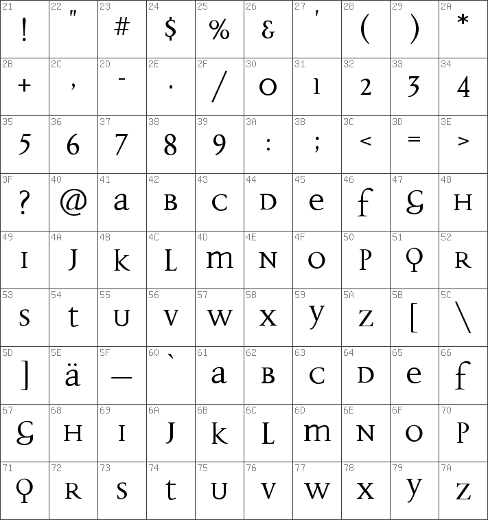
- Description: FF Disturbance is Jeremy Tankard's answer to a number of well-known typographers before him who advocated the simplification of the alphabet structure in order to enhance readability. Our present writing system is a composite of two systems: Roman upper case letters and medieval lower case ones. With FF Disturbance, Tankard took on the challenge of creating a new, alphabet that combined the upper and lower case forms more harmoniously. His idea was to select the most extreme letter shapes, the best of both worlds, and put them into one alphabet to achieve maximum legibility. His response to the ongoing debate about legibility is that the visual rhythm of the text is a vital consideration. "There is a theory that people only read what they want to read. If good rhythm makes a face flow well, then the reading becomes much easier. " This fascination with typographic rhythm stems from Tankard's fascination iwth musical composition. FF Disturbance also contains many ligatures that both add "color " to the typeface and assists in its flow and rhythmic patterning. Since the capital forms are used for the characters B, D and H, there are fewer ascenders, thus creating new word shapes. The increased ascenders of K and L, plus the use of the ligatures recreate the vertical movement within the type. This counteracts the monotonous appearance of capitals within a block of text. As soon as it was published, many critics voiced their acclaim for FF Disturbance. . . well, except for the deisgner's mum who, he says, ". . . thinks it's too difficult. "
Comments (0)
Please login!